36 EXCURSIONS & EXCAVATIONS in the HERMETIC GARAGE
14: The monochromatic garage of J. G. (aka Mœbius)
I first read the Garage—most of it—in black and white, as it appeared in Heavy Metal, so maybe I’m prejudiced. As I said earlier, I was never happy with the coloring in the Marvel edition. And when I read the Garage in French this year—as it appeared in Metal Hurlant—of course it was in black and white.
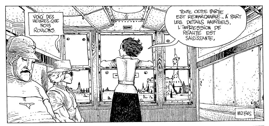
And there’s no question, it looks good in black and white. Looking at the first panel on page two of episode 7, I took a deep breath. I smiled. I looked at it for several minutes, as the sun fell on the page. “EXCEPT FOR THE USUAL DETAILS,” says Okania, “THE IMPRESSION OF REALITY IS STRIKING! ”
I was never sure what those “USUAL DETAILS” were, but I now suspect she means the image is flat, and in black and white. Despite the impression of reality, this is not a real world. It’s part of a narrative made up of successive and separate images; and, as she speaks, there may be reason to suspect neither images nor narrative can be put together to make a coherent, self-sustaining whole.
But we read with hope, possibly with trust. It’s hard enough, sometimes, to make sense of experience. That, too, may depend on trust; and fiction—or art, in the broadest sense—reflects and depends upon a world we take to be more coherent and complete, from which it may be viewed and considered. Art is a secondary, not a second creation—a means of reflecting upon a primary world, or extending our experience in it. Perhaps it’s why this image continues to delight me:
It’s a wide panel. The sleeping passenger is on the left, Samuel Mohad upright but impassive beside him. Okania stands in the center, arms leaning on the window, face turned to the direction of travel, hair blowing in the breeze. It captures a moment of concrete specificity in an invented world, and makes it real. To be more precise, the graphically articulated dream of this fictional moment recalls, for me, the concrete experience of such moments in the world of my existence, abstracting for the sake of the story a momentary, alert and responsive delight in being.
Other panels work in different ways: the curious, imposing and somehow troubling image of Mausoleum L33, in episode 9, always fascinated me; the last panel in episode 12...
And so on.
But it wasn’t until I came to episode 28 that I was actually startled by how good it looked. The careful shading in the first panel provides a suitable follow-on from the full-page that ended the previous episode. With the exception of the final panel, however, the remainder of the installment has almost no texture. Instead, everything is presented in a marvelously clear and precise line, so that the pages are very light.
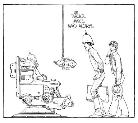
Precision and clarity were perhaps the foundations, for me, of Giraud’s visual appeal. It’s not that I require to be seduced, by precision, into the acceptance of an illustrated world; over the years, I’ve been exposed to (and have taken delight in) a broad range of cartooning conventions. The assured figure work, mastery of perspective and invention of detail, however, provides not only an illusion that the image might have been drawn from life, but, beyond narrative essentials, a surplus. Complex devices depend from above in Room 6. I needn’t believe I’m surrounded by dust and spiders to feel, when Giraud offers a viewpoint taking in some of the struts from which these devices are hung, that the mysterious space of the world has been extended and deepened. A more modest but equally careful use of detail occurs on page 2, when Okania does not simply remove her headgear, but unbuckles it and rearranges her hair in successive panels.
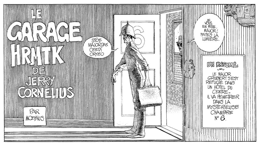
So why did the visual clarity of this episode startle me? Because it’s a clarity badly marred by coloring in Marvel’s 1987 edition. The darkness of the room in the first panel was signalled originally both by text and by shading, but the shading is swamped by color. (The placing of the title in a box, in order to reletter the translation, also reduces the visual space ahead of Grubert.)
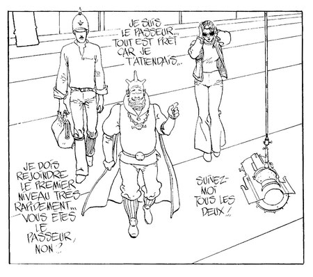
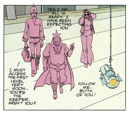
Color likewise imposes upon the clarity and openness of the second panel, and utterly destroys the visual poise of the second page. The first two panels aren’t so bad, with palest green for the background, even if the colors on the figures are flatter and darker than they need be; but the remaining four panels are a disaster. In the original, the last panel differs noticeably from the other five; here it disappears in the murk—as does the crucial detail that Graad has removed the point of Grubert’s helmet in the previous panel.
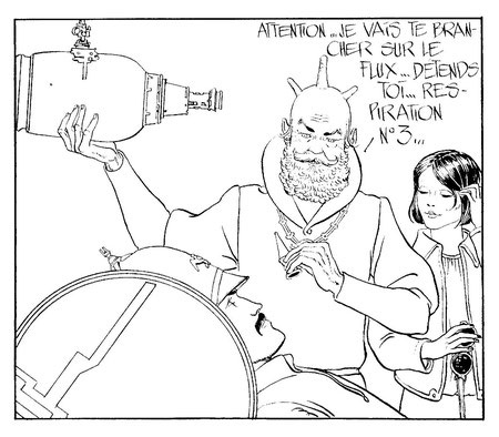
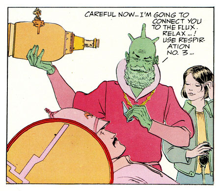
Comparing the original pages in Metal Hurlant with the 1987 book, it seems more than ever obvious that if the Garage is ever to be reprinted in English, it ought to be either completely recolored, or printed in black and white. The case for recoloring rests primarily on the possibility that it might be done well—as well as on the aesthetically negligible argument that some among the wider audience upon whom the economic viability of such a project would depend might mistakenly judge a black & white presentation to be cheap and only half-finished.
On the other hand, the strongest case for black & white is made by the 1987 book. Among the handful of panels and pages whose coloring might be argued to be successful or attractive, are there any that unquestionably improve on the black & white?
Perhaps the first page of episode 12 (despite some minor inconsistencies) is one of the few where coloring enlivens the panels. Page 2 of episode 13 positively glows. The first panel of episode 5—the Jerry Cornelius panel—also strikes me as attractive, even if the coloring of the photograph doesn’t make a lot of sense. Episode 1 is colorful and fairly pleasing. Episode 21 gives an idea how a restrained palette might complement the art without smothering the shading—also pages 1 and 3 of episode 35.
One is not, however, overwhelmed by the number of such examples. The colors in much of the remainder of the book are, at best, inoffensive, even if they often appear rather arbitrary. And some chapters—2, 8, 16, 22, 26, 28 and 30-33—are not only unattractive in themselves, but compare badly with the startling clarity of the original black & white.

